Friday, 28 August 2015

How to create your own spray booth.

Many peoples favourite way to use our Inks in a Bottle, and the New PURE Colour Chemistry inks is as a spray ink. This can be fast and beautiful. This little post is to share how we protect the rest of our stash whilst doing this technique.
We are all crafters on the design team and don't have expensive professional spray booths in our home, so what do we use?
I started out with cardboard boxes that I got from our office supplies warehouse, they held paper pads so  were quite strong, and A3 sized, perfect! but we stopped getting pads packed this way BOO! how dare they?
DT member Lynne Vowles uses the boxes that boots come in and tells me that shoe shops are happy to get rid of these and may save some for you if you ask.
I am a big fan of spraying out in the garden, especially if I want to do big sheets of card. I have been known to re-purpose A1 mount boards this way, spraying over the boring white back. Elaine Kettle likes using her garden too.

I started to use a cat litter tray I am fairly certain didn't cost me very much. This is Barbara Daines method too.


The cardboard boxes are cheap or free but won't last for ever. I used to lay a craft mat in the bottom to collect the over-spray which makes the great source of ink more use able. Plastic on the other hand, it washes out. If you are changing colours a lot I suggest you wipe out your tray with some kitchen roll, or better still soak up excess ink on a tag or scrap card.

Then I as I was teaching bigger and bigger classes I decided I needed something not too expensive and that stacked. I would have gone the cat litter tray route had I been able to find a cheap source but I was going through a "use what you have" phase of my life and realised I had 20 of these trays from Ikea, it did mean emptying a few, but it worked, and I will be buying more of these for the Autumn classes.


My best advice is to keep what ever you use close to hand, because if you don't, like me you will be too excited about your project and promise yourself you will be careful and it is just one quick spray and before you know it everything on your desk with have a nice splash of Paris Pink on it. What ever you do with our inks I hope you take the time to enjoy what you do..... now that would make a stamp, oh yes it already is stamp x


Sunday, 23 August 2015

How to do my favourite technique with spray inks

For a long time I have wanted to write a post about using the bottled inks as sprays. But all the time I am finding more ways and it was one of those impossible tasks you set yourself which grows and grows and so you never do it.  Yes I do that a lot!

So today I thought why don't I just show you a couple of techniques that work well together. I know I called this post my favourite technique, but that is a big ask, as I am not sure what is my favourite technique, and like most people it is usually the one I have just learnt or developed. But this set of techniques used together in this way is probably the one I use the most.

There are three steps to this, all of which work on their own or with other techniques.

1. Swipe   2. Spray  3. Spritz

All very easy really, but using them together and in this way is a really great go to way to use the inks.

1. SWIPE

Apply ink to the card/tag and swipe the ink over the whole surface. I use a sponge or a paper towel or a baby wipe...... what ever is close to hand, by preference I guess a sponge.
This puts a light colour over the whole surface of your tag and so gets rid of that "whiteness"


2.  SPRAY

It is important to use plenty of ink but not all at once or you loose the spray effect. Be prepared to spray several times drying in between coat, this is one of those times when we say several light coats in better than one thick coat. The good news is you can speed the drying process with a heat gun or a hair dryer. If I doing lots of pieces of card I lay them out in a clean tray and place that some where warm, Over a radiator in winter outside in the summer.


3. SPRITZ

 This final step adds depth or highlights to your project. For this I use a dark ink is the same colour family as the main ink colour so for reds I use Brazil nut. For blues use Bobby's grey and Denim Jeans. For yellows I might use an orange or a green.
This is when restraint is needed. One or two little sprays off one corner of the project. A light touch is essential so test out the spray on some scrap paper or spare card. Aim your spray off the edge of the card and move onto the project as far as you want to go.


Don't forget to mop up the left over ink on another tag,hopefully you will see that using the range of colours you get more depth,, and that first swipe layer really helps you save ink, if you try spraying to cover all the white it will take a few layers. 


As I said this a set of techniques I used the most often.
It gives you depth of colour. Everyone will be different.

Have fun and live your life in full colour!

In these photos I have used the Inks in a Bottle which are ideal for using as spray inks. x

Monday, 17 August 2015

Through the window


Elaine here with another card made using the Vintage Blue Inks from Oak House studio - both the Ink in a Bottle spray and the Pure Colour Chemistry Watercolour Ink.  


I started by spraying some watercolour paper with Vintage Blue Ink in a Bottle and added a little Delicious Damson too.  I silver embossed the Block Frame stamp, painted the frame with Vintage Blue Pure Colour ink and cut out the sections.  To add a little more interest I painted Pure Colour ink onto a small acrylic block and stamped this to create the mottled 'brick' pattern.   The flowers are from the Spring Blooms set (as is the sentiment) - these were silver embossed onto some card sprayed with Delicious Damson and Paris Pink Ink in a Bottle and arranged in a plant pot.  The net curtains are the Mack Rose stamped with White Brilliance onto vellum.

I'm loving playing with these new Inks - they're so intense and allow you to create the shade you want.  I'm looking forward to getting some more colours and having a mixing session in the lab....lol!!

Elaine x

Friday, 14 August 2015

Sepia Tones - the Poinsettia


I managed to get my hands on some of the new inks from Oak House Studio namely the Pure Colour Chemistry watercolour inks - they are extremely intense so a little goes a long way and they lend themselves to painting, misting, mixing and writing etc etc!

Here I've just used the Sepia tones to show the different products available.


I started by spraying a sheet of watercolour paper with Vintage Sepia Ink in a Bottle and then overspraying with the Glorious Gold.  If you don't have Ink in a Bottle then why not buy an empty spray bottle and water the Pure Colour down.   I used half the background over stamped with the English Garden Text. The rest I stamped with the Build Your Own Poinsettia set of stamps (3 bracts and a centre) and gold embossed.  The outer leaves I painted with Vintage Sepia Pure Colour Chemistry - a deliciously rich ink I have to say - and then glued it all together with silicone glue to give some height.  I glued beads to the centre too.

 
 I've stamped the Friends Like Fruitcake with Chocolate Pigment Ink and clear embossed, sponged a little Vintage Sepia Ink in a Bottle and then matted this on some card painted with the Pure Colour Chemistry Ink.  To finish I created some stripey ribbon by just dragging a paint brush with the intense ink along one side and heat drying to crinkle.
 
Pop back on Monday for a look through the window using Vintage Blue.  I love all the shades you can get from just one bottle of ink and can't wait to acquire more colours. 
 
Elaine xx


Friday, 31 July 2015

Fluttering Butterflies...

Hello everyone, Anne here again!

Today is my 4th and final project as Lynnda's Guest.  It has been a real pleasure
and privilege to use Lynnda's wonderful stamps and fabulous inks - thank you so
 much for having me here Lynnda!

This week I wanted to show how versatile Lynnda's Colour Chemistry inks are and
 I used the bottled ink to colour everything from the base card to the butterflies
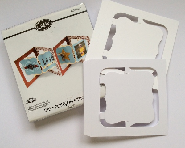
 and roses.  I made two cards using Karen Burniston's original accordion die by Sizzix.


This is two cards side by side, I wanted to show how the butterflies appear to be flying,
by adding a layer of acetate.


I started by cutting four of the above shapes in card and two in acetate for each card.


I joined two of the shapes for the front and stamped onto the acetate middle layer using
 the CC Ink Pad in Slate Grey and applied clear embossing powder. The butterflies
 and roses were coloured and fussy cut.


Each of the two card layers were dry embossed and then coloured with CC inks
 which I added to a spritzer bottle but you could equally paint the inks on.


For the darker card I spritzed the base card with the yummy Simply Chocolate CC ink
and I added a card based sentiment panel - coloured in the absolutely fabulous
Vintage Sepia ink, my new favourite, it is perfect for 'ageing' elements.


Apologies, the acetate makes it hard to get a decent photo.


  I just love the effect it adds by giving the impression of the butterflies
 fluttering away.

Oak House Studio Products 
Simply Chocolate (base and butterfly)
Citrus Yellow (butterfly)
Pumpkin Pie (butterfly)
French Wine (roses)
Citrus Lime (roses)
Vintage Sepia (sentiment base)
Slate Grey
Oak House Studio Stamps

Thank you for all your lovely comments, I have really enjoyed reading them
and once again - thank you Lynnda for having me as Guest and giving me
 the opportunity to use your fantastic products!

Hugs, Anne xx

Friday, 24 July 2015

Medium Sunflower and something extra

Hello Everyone, Anne here again.

Thank you so much for the lovely comments you left on my second project for Lynnda last Friday.

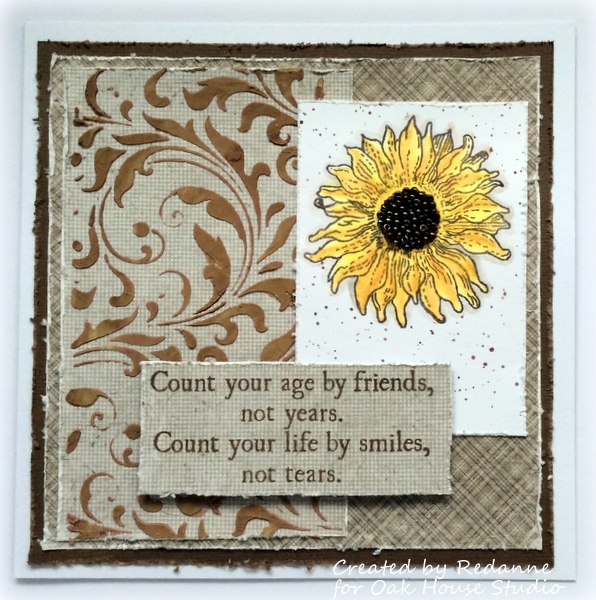
This week I wanted to experiment with Lynnda's wonderful Colour Chemistry inks to see how they work with other mediums.  I made another card using some brown toned cardstock.

As you can see, I used Lynnda's medium sunflower but I also used the Colour Chemistry ink in Simply Chocolate to colour some white texture paste that I had in my stash (nothing expensive, just some that came from Lidl).
I put some of the white paste into a plastic cup and added some of the Simply Chocolate ink (ratio approximately 10 parts paste, one part ink).  I was careful to mix enough to spread across the whole of my stencil.  I cleaned my stencil in cold water immediately after using it.
The paste dried to a wonderful milk chocolate colour.  If I had wanted a darker colour I could have put the stencil back over the dry paste and used a brush to apply more ink, but I was happy with the result I achieved with the coloured paste alone.
While the paste was drying I moved on to the sunflower.  I coloured it with Citrus Yellow Colour Chemistry ink and then added some 'shading' with Pumpkin Pie.  Once coloured I watered down some Simply Chocolate and used it to create a shadow around the whole flower. 

The centre was coloured with Simply Chocolate and then I added seed beads for dimension.  I put some Simply Chocolate onto my craft mat, dipped a thin paint brush into the paint and added a few splats around the edges of the sunflower.
I stamped Lynnda's lovely new sentiment stamp onto some co-ordinating cardstock, distressed the edges and added it to the card.
The finished card once again.

Ink Products Used:
Simply Chocolate
Citrus Yellow
Pumpkin Pie


Thanks so much for looking, I hope to see you again next week for my
final project for Oak House Studio.

Hugs, Anne.

Friday, 17 July 2015

Triple Butterfly and Spray Ink

Hello again, Anne here!  I just wanted to say a huge thank you
to everyone who called here last week, your comments are all very much appreciated.

This week, for my second project I used Lynnda's stunning triple butterfly and I used
 the Colour Chemistry Inks to create sprayed backgrounds. 


The finished card size is 7" x 7".


I started off by spraying some large pieces of card with French Wine and Citrus Lime
 inks which I had placed into a spray bottle.  I just gently sprayed as the colours are
 very concentrated and a little goes a long way!  I used an old pizza box as a
 'spray booth' to avoid spraying the whole of my work area. I stamped one piece
 with the beautiful 'Without Change' stamp, using a French Wine Colour
 Chemistry Pigment Ink pad.  I covered it with a clear embossing powder and heat
 set it.  I added a little Citrus Lime to a piece of felt and edged each of the
 three coloured  squares (I am not a fan of white edges!) and then layered
them on to the base mat,


You have probably guessed by now, but I love colouring up ribbon to match my projects
 and I spritzed this piece with the gorgeous French Wine Ink in the spritzer bottle
 I used earlier.  I scrunched it up and heat dried it.  You don't have to scrunch,
 it is just my preferred method.


A close up of the finished ribbon and those lovely words.  Lynnda's stamps work 
perfectly every time...


I coloured some more card with a wash of the inks and stamped the gorgeous Triple Butterfly several times on each, in Slate Grey and then fussy cut the three sections individually and then layered them up to give lots of dimension.  Yes, I did cut the antennae out too!

Another view of the finished card.

Products Used:
French Wine
Citrus Lime
French Wine
Slate Grey
Triple Butterfly
Without Change

For next week's project I have done a little experiment with Lynnda's inks, I hope
you will come back then to have a look to see whether it worked or not!

Thank you again!  Hugs, Anne xx

Message From Lynnda: If you are enjoying Anne's post you may like to come and find out more about what we do, come and like our Facebook page