Showing posts with label Pure Colour Chemistry Inks. Show all posts

Friday, 8 July 2016

Step by Step Project from Nick Roberts

EDITED: Ekk life has been a bit manic recently and I posted Nick's post this morning and forgot to explain about this month's TAKE 5  challenge.... This months topic is Rainbows.... as many bright colours as you like. Show me some colour! Post your Challenge entry on your blog or your Facebook page. Just make sure you tell us it is there. Now back to Nick...

Morning. I am very excited to share this post with you today, after being invited by the Lovely Lynnda of Oak House Studios to be a guest designer. The theme is 'Rainbow' which gave me the scope to create something very different, I chose to design a wall hanging. I used a selection of the wonderful Colour Chemistry Ink's. They are such rich pigments and the colours are so vibrant, they are great fun to use either in their concentrated form or diluted to give the shade required.


The base for this project was a piece of reclaimed timber, which I sanded before painting with Slate Grey Cosmic Shimmer Chalk paint.

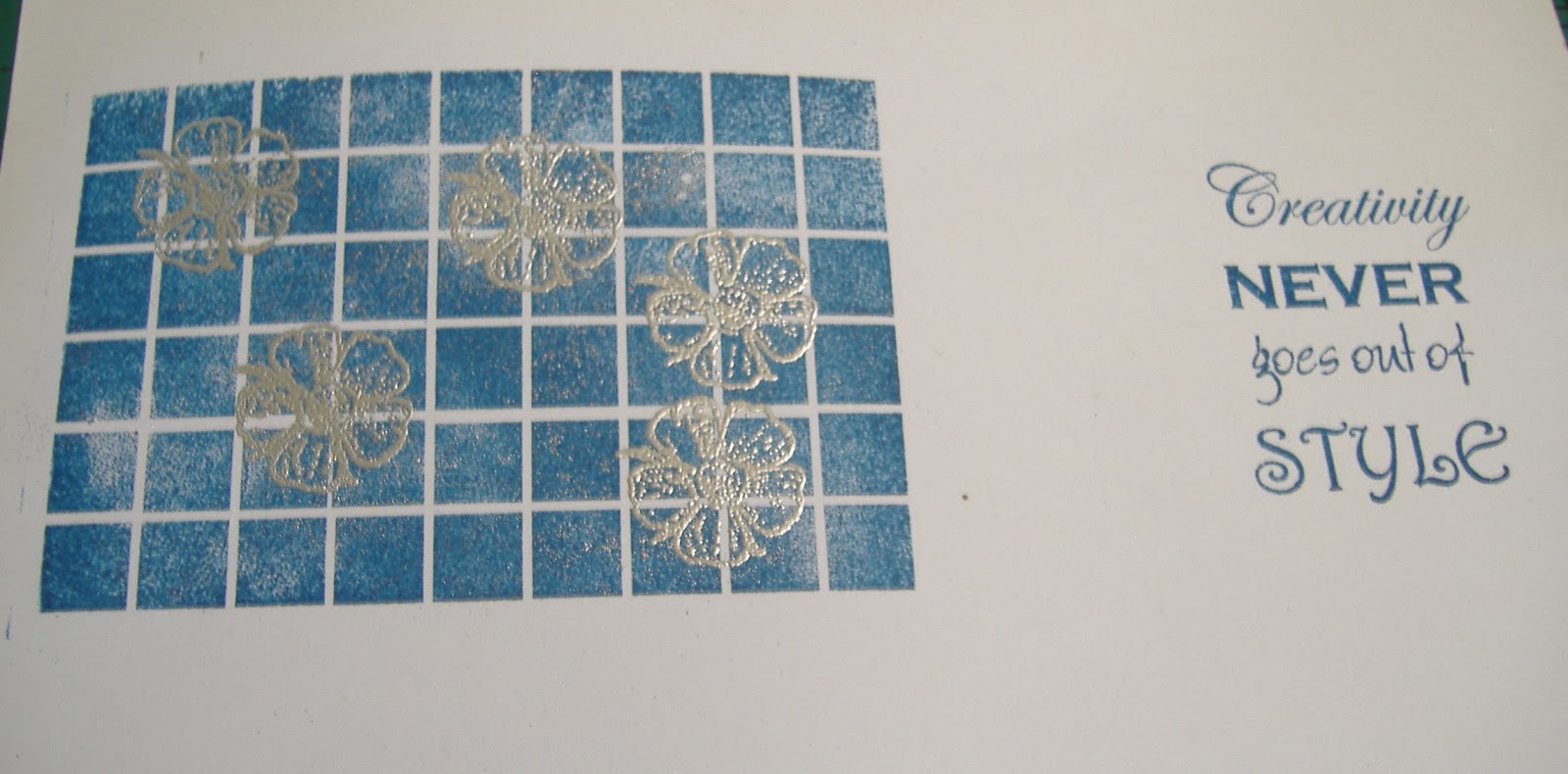
On a piece of Super Smooth Card I stamped the lovely background stamp and a wonderful sentiment from Oak House Studio, using the Navy Blue, Colour Chemistry pigment pad. I love the sentiment, it's so nice to have the mixture of fonts making it more interesting and adds to the feel of the project. I used versamark and Silver Embossing powder to add the Dog Rose to the background.

I then positioned the background and sentiment onto my base, then created a frame made from branches that I cut to size to surround the image. I secured these using 3D glue gel.

Next I cut some lengths of Hemp and dipped them into the bottles of Pure Colour Chemistry Inks, for this project I used Bottled Sunshine, Pumpkin, French Lavender and Totally Turquoise. I was over the moon with the strength and depth of colour, which wasn't lost at all once they had dried.


I took a piece of gauze and moped up all the left over ink from my glass mat and left to dry. I also made some simple round flowers using the Hemp that I had coloured and glued them in position using Cosmic Shimmer glue.

I mixed up some Bottled Sunshine Colour Chemistry ink with Gesso and flicked over the wood to create some added interest and then repeated with some plain white gesso.

I threaded some matching beads onto wire and then assembled the piece. Finally I distressed around the edges of the project with sand paper to bring the elements together.

I hope you have enjoyed the step by step I have shared today. I love this piece with the vibrant rainbow colours, a little bit of a different way to use the lovely stamps and inks.
Thank you ever so much to Lynnda for inviting me to take part in this. I have thoroughly enjoyed using the stamps and the Colour Chemistry Inks are just a pleasure to use, giving such a wide range of results. A must ave crafting essential. I have loved mixing my own colours in the spritzer bottles and have had hours of fun creating different backgrounds.

Tuesday, 7 June 2016

Introducing The New Texture Stamp Set

Hi all
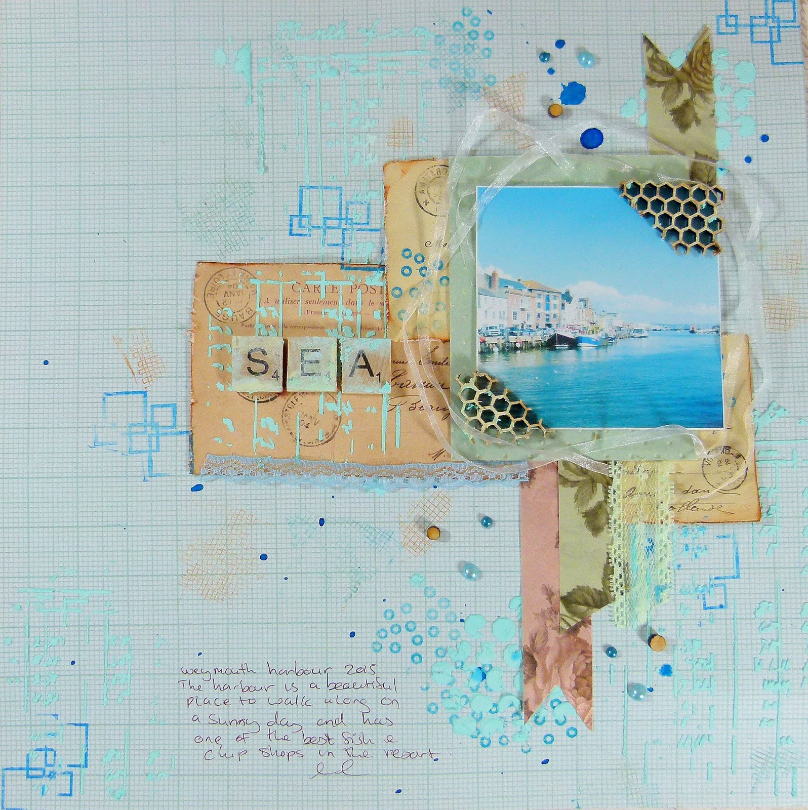
I am up on the Oak House Studio Blog with a new layout and I have some new texture stamps to show you. These are the larger versions of the texture stamps that come with the Double Daisy set but now are a good size for mixed media projects.


I started my page off with some stenciling around the layout using texture paste mixed with Peacock  Pure Colour Chemistry Ink. I used the Ledger Sheet stencil mask by The Crafters Workshop and added the texture randomly around the page. I then Flicked Sapphire Acrylic Ink


                            I added some lace trims to my page and dotted around a few pearls


I cut up a couple of sheets of Gypsy gypsy paper pad and cut out the postcards. I distressed the edges and added stenciling on them before layering them up.


I took the texture stamps and stamped them around the page and over the stenciling. I used Vintage Sepia and Cobalt Blue Colour Chemistry Ink Pads.


I added more of the texture past around the scrabble tiles to distress them


Thank you for visiting 

Friday, 22 April 2016

First Adventures with PURE inks by Diane Ingram

Dip, Drip, Dunk and Dye!


Perhaps a more appropriate title for this post would be “Dyed and gone to heaven” as I have spent some very self-indulgent hours playing with Oak House Studio inks.  So much fun in one little bottle and endless possibilities. The more I played the more I discovered ….sometimes by design….sometimes by accident!  I managed to create some interesting background papers when I knocked over a full bottle of diluted Jubilee Blue…. without its lid on. 
Top tip….the pipettes are excellent for sucking up spilt ink and decanting back into the bottle…the rest can be mopped up with copier paper and/or scraps of ribbon lace and punched shapes…..in fact anything that comes to hand that could be dyed.


After my exploration session I was left with a fantastic bank of pieces to use….  
….and an idea for adapting Shibori (Japanese fabric dyeing).  Instead of fabric I used to 2 sheets of tissue paper folded together to create some designer wrapping paper.
Working with a “puddle” of water and a “puddle” of Colour Chemistry Ink, I dipped the folded paper in and out of the water and ink…depending on the pattern and effect I wanted to create.

The paper had to unfolded while still wet and laid out to dry.
I created several designs with different folds and different shades of ink – Waterfall, Vintage blue, Jubilee Blue and Blue Jeans.


Once dry (which actually didn’t take very long) it was time to wrap my friends present. The “dyed” look is very fashionable at the moment in home trends and so is accents of gold. The finishing touch was an initial cut on a Cricut then stamped with the Thoresby Background stamp.  My gold ink pad was very old but it was improved with a few accents of Oak House Pure Gold Acrylic Ink ….. This ink is so beautiful and difficult to capture on camera how shiny and gorgeous it is…..true liquid gold.


As I am an extremely frugal crafter…I used the negative of the initial to create a coordinating card. Keeping it “Clean and Simple” I attached the shape over one of the premade backgrounds…. a few splashes of the amazing Pure Gold added some pretty detail. The sentiments (Oak House Birthday and Best wishes text stamps) were stamped with Cobalt Blue and Powder Blue pigment ink.


I will be posting some more “Something Blue” projects and further details of my “dyeing” adventures on my blog http://justaddglueto.blogspot.co.uk/ …plus a very frugal envelope to go with my card, quite by accident I created a Verdigris effect with the Pure Gold and Colour Chemistry inks which I was quite pleased with, see what you think, I’d love you to pop by and say hello.
.....and finally very big thank you to Lynnda and Oak House Studio for inviting me to play along with the Take Five event….I do hope you join in to……...    Happy Crafting, love Diane


Saturday, 17 October 2015

Mixed Media Canvas - Daisies and Rainbows Stamp Set

Hi all

I'm back with my first official post as a Design Team Member and I am really excited to be here as I love the Oak House Studio products to bits. Many of the products I have used will be featured on HOCHANDA TV  -  Oak House Studio have 3 shows:

Wednesday 21st October

11am Roses
2pm Double Daisy
6pm  Best Bits


 Would you like to learn how to make a mixed media canvas? Well I will show you xx


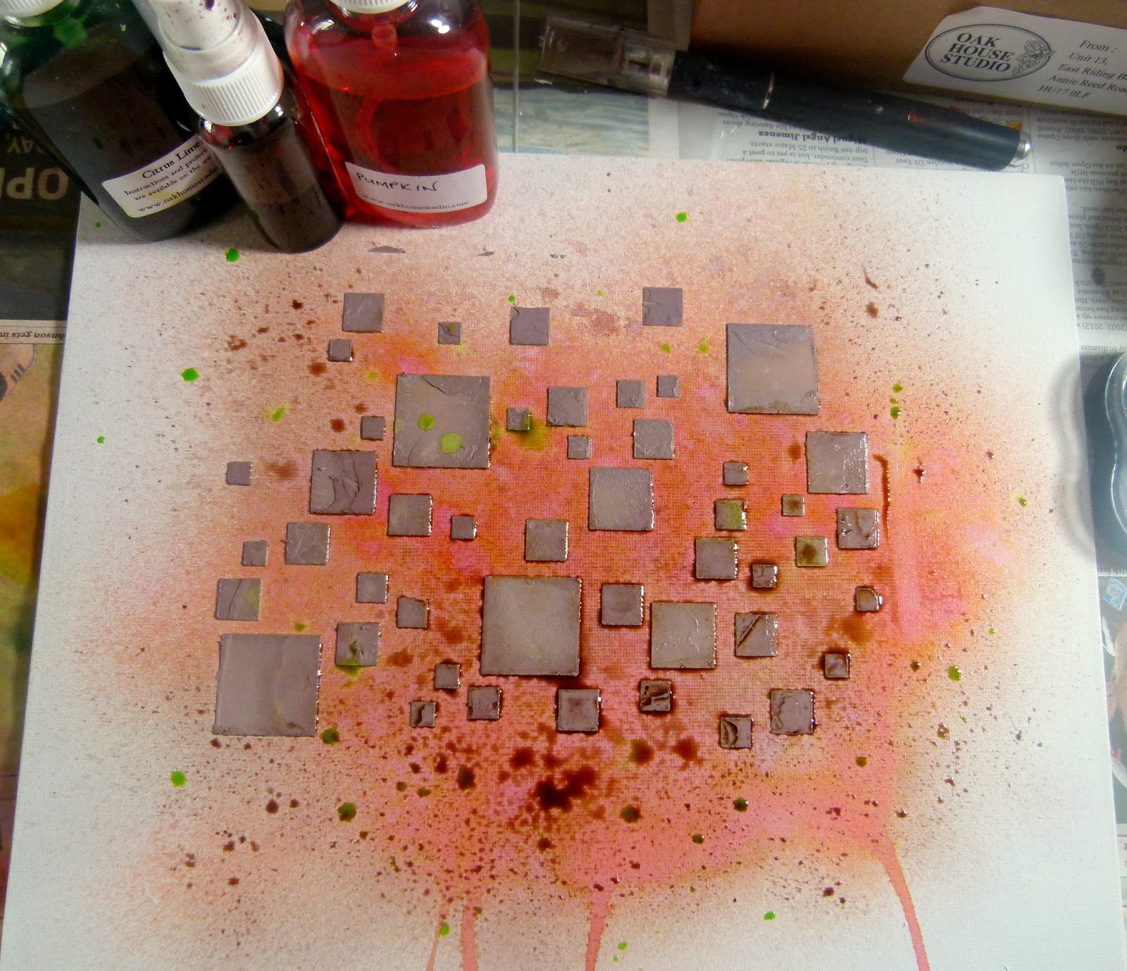
First spray the canvas with Pumpkin Ink In A Bottle and allow some of the ink to run down the canvas.

Oak House Studio Inks In A Bottle Pumpkin and Pure Colour Chemistry Brazil Nut

Mix Brazil Nut Pure Colour Chemistry with some texture paste. Use a stencil to spread the paste onto the canvas.

Add a few drops of Brazil Nut Pure Colour Chemistry to an empty spritzing bottle and add a bit of water to make a spray. Spritz this over the canvas to tone down the Pumpkin ink. Then flick Citrus Lime Ink In A Bottle over the page.

Inks In A Bottle Citrus Green, Brazil Nut Pure Chemistry

Next using the Square Grid Stamp apply Triple Vintage Browns ink to it and stamp around the canvas randomly. Next using the Sunshine Sentiment and Textures set, stamp around the canvas using Golden Oak ink. I then took one of the stamps from the New Daisies and  Rainbows stamp set and stamped that at four points on to the canvas.  The new Daisies and  Rainbows stamp set will be premiering on Hochanda as part of an exclusive bundle.

Daisies and Rainbow Stamp Set

Now its time to get the paper layers built up. I matted the photo onto patterned paper first but did not stick it down as  I wanted to place all the paper pieces in the right spot first.


I used a selection of die cuts and trimmed strips of patterned paper to make the layers. I placed them so that I wouldn't cover over the stamp work as I wanted that to be part of the texture.


Its time to add the embellishments. If you do not have any to match the colour scheme then alter them with ink !!. I used cream paper roses and spritzed them with Citrus Lime Ink In A Bottle and then Brazil Nut to get an Autumn green. I would recommend covering the entire workspace with newspaper including the wall.


I used the quotes as the title by stamping them onto the board using black ink. If they do not stand out very well then stamp onto Stamping Card and spritz with ink. I tore around the edges so it blended in better. This stamp is also from the New Daisies and Rainbows Set.


Don't forget to watch HOCHANDA on Wednesday - the first show is at 11am. 

Thank you for visiting 


Monday, 17 August 2015

Through the window


Elaine here with another card made using the Vintage Blue Inks from Oak House studio - both the Ink in a Bottle spray and the Pure Colour Chemistry Watercolour Ink.  


I started by spraying some watercolour paper with Vintage Blue Ink in a Bottle and added a little Delicious Damson too.  I silver embossed the Block Frame stamp, painted the frame with Vintage Blue Pure Colour ink and cut out the sections.  To add a little more interest I painted Pure Colour ink onto a small acrylic block and stamped this to create the mottled 'brick' pattern.   The flowers are from the Spring Blooms set (as is the sentiment) - these were silver embossed onto some card sprayed with Delicious Damson and Paris Pink Ink in a Bottle and arranged in a plant pot.  The net curtains are the Mack Rose stamped with White Brilliance onto vellum.

I'm loving playing with these new Inks - they're so intense and allow you to create the shade you want.  I'm looking forward to getting some more colours and having a mixing session in the lab....lol!!

Elaine x

Friday, 14 August 2015

Sepia Tones - the Poinsettia


I managed to get my hands on some of the new inks from Oak House Studio namely the Pure Colour Chemistry watercolour inks - they are extremely intense so a little goes a long way and they lend themselves to painting, misting, mixing and writing etc etc!

Here I've just used the Sepia tones to show the different products available.


I started by spraying a sheet of watercolour paper with Vintage Sepia Ink in a Bottle and then overspraying with the Glorious Gold.  If you don't have Ink in a Bottle then why not buy an empty spray bottle and water the Pure Colour down.   I used half the background over stamped with the English Garden Text. The rest I stamped with the Build Your Own Poinsettia set of stamps (3 bracts and a centre) and gold embossed.  The outer leaves I painted with Vintage Sepia Pure Colour Chemistry - a deliciously rich ink I have to say - and then glued it all together with silicone glue to give some height.  I glued beads to the centre too.

 
 I've stamped the Friends Like Fruitcake with Chocolate Pigment Ink and clear embossed, sponged a little Vintage Sepia Ink in a Bottle and then matted this on some card painted with the Pure Colour Chemistry Ink.  To finish I created some stripey ribbon by just dragging a paint brush with the intense ink along one side and heat drying to crinkle.
 
Pop back on Monday for a look through the window using Vintage Blue.  I love all the shades you can get from just one bottle of ink and can't wait to acquire more colours. 
 
Elaine xx